When sharing our concept of the branding process, we try to always emphasize that a company’s graphic identity is the front door to its business, especially in this day and age of a readily-available, 24/7 online presence. The logo and other branding marks should set the tone and immediately offer the essence of the brand. Many times your company’s graphic identity provides a first impression to a potential client or anyone else who happens to stumble upon your brand.
But when we looked in the mirror, we didn’t see it. Our graphic identity, specifically our logo, didn’t tell our story. It didn’t shout to the world just what The Remedy is all about. So, after advising so many clients and putting so much effort and passion behind preaching the importance of the branding process, we found ourselves in the classic “cobbler’s children have no shoes” situation.
Sadly, this happens more than we would all like to admit, no matter the profession. As New York Times best-selling author Peggy McColl succinctly put it, though we all know what to do and we can guide our clients in the best proven strategies, sometimes our own businesses don’t get the same attention. Fortunately, we noticed and did something about it.
We certainly understand that branding isn’t just a matter of looks. In fact, an organization’s graphic identity – the logo, name, color palettes, and other design treatments – represents only about 10% of what constitutes a brand. The other 90% is the journey that leads to your identity and encompasses issues such as strategic thinking, assessment of client needs, the figurative and literal promises you make, your inherent culture, and more. But to us, that 10% didn’t properly reflect our other 90%.
So as we set off on this journey, we started with a vision for what we wanted our “front door” to open up to. In our minds, The Remedy is a smart, modern, new-age boutique branding agency. We’re not Mad Men, nor do we have any stuffy, smoke-filled boardrooms (our boardroom is fresh, clean, and filled with windows to the world — or at least downtown Dallas). And we certainly do not have any junior partners. We’re agile. We’re efficient. We’re fun and energetic. We work with a purpose. We can be edgy, if that’s what’s called for. But, most of all, we deliver high-quality work, on-time, on-budget, and on-point.
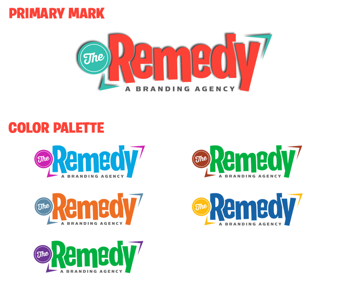
So with that, we introduce to you, the new graphic identity of The Remedy. It’s simple, understated, a little out of line, as vibrant as it needs to be to fit in with its surroundings, and fully ready to tell the world The Remedy’s story.